Ushering in the “new order” of coffee
CLIENT
New Order Coffee Roasters
PROJECT DURATION
May 2016 to present
ROLE
Brand Identity Strategy
Brand Identity Design
Customer Experience Design
Illustration
Package Design
Environmental Graphics & Signage


Project Overview
New Order's team is comprised of industry experts, ready to change the craft coffee industry and move beyond the "third wave"; no dark woods, no snobby baristas, no waiting fifteen minutes for a pour over. Their team seeks to use their expertise to deliver the best product using the most advanced technologies, while not losing sight of their values: "Founded with a gleeful defiance to the status quo, New Order has a singular, dogmatic aim: to delight and energize your everyday life."
At the beginning of the project, New Order's team revealed they previously worked with another brand team, but had been unhappy with the design outcome and wanted to start from scratch. They wanted an identity that "pushed the envelope" and did not look similar to any of their competitors.
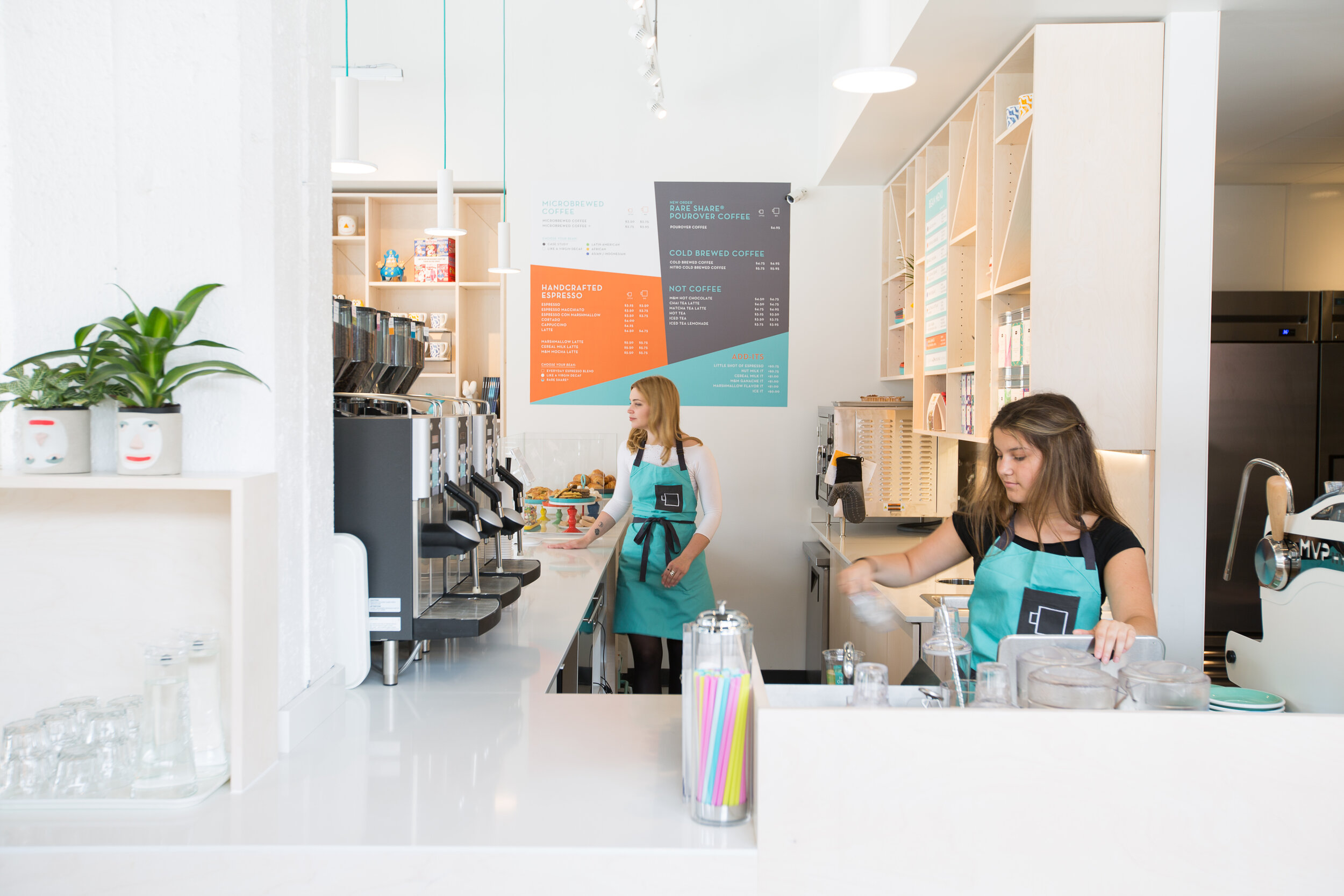
The initial plan for the coffee shop was in a historic building in Detroit. Although the location eventually changed, the historic geometric, art deco interiors played a role in visual development. Working closely with a Detroit-based architecture team, Et Al Collaborative, the brand identity needed to be bold to contrast with the planned natural woods, light counter tops, and natural light-filled space for the new location. The brand had to come across as welcoming and inclusive for a variety of demographics in its first brick & mortar located in Detroit’s Brush Park neighborhood, but it also wanted to be unlike any other coffee shop in the city.
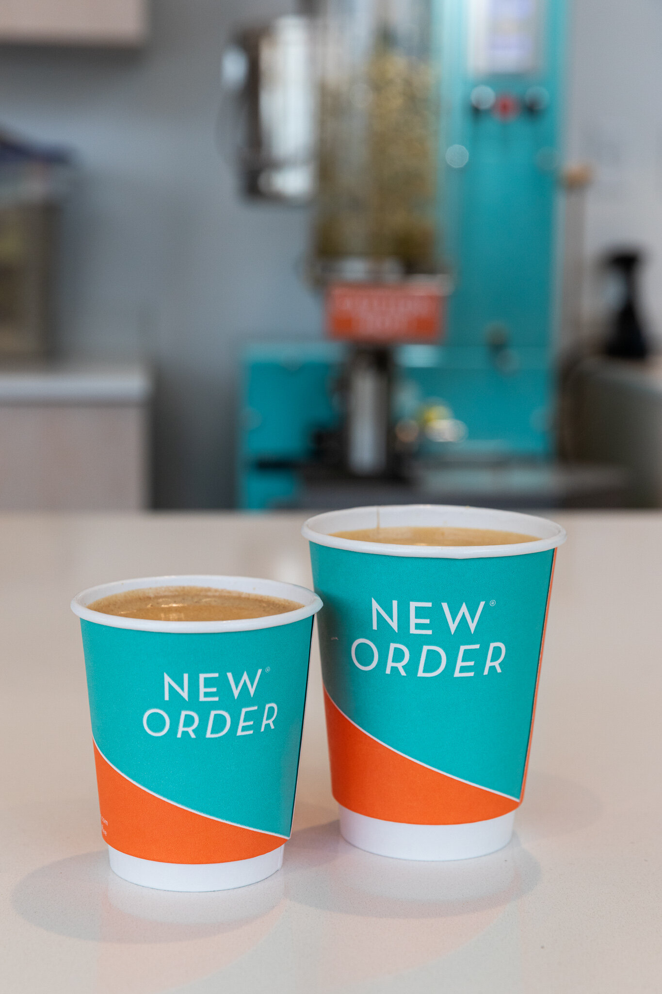
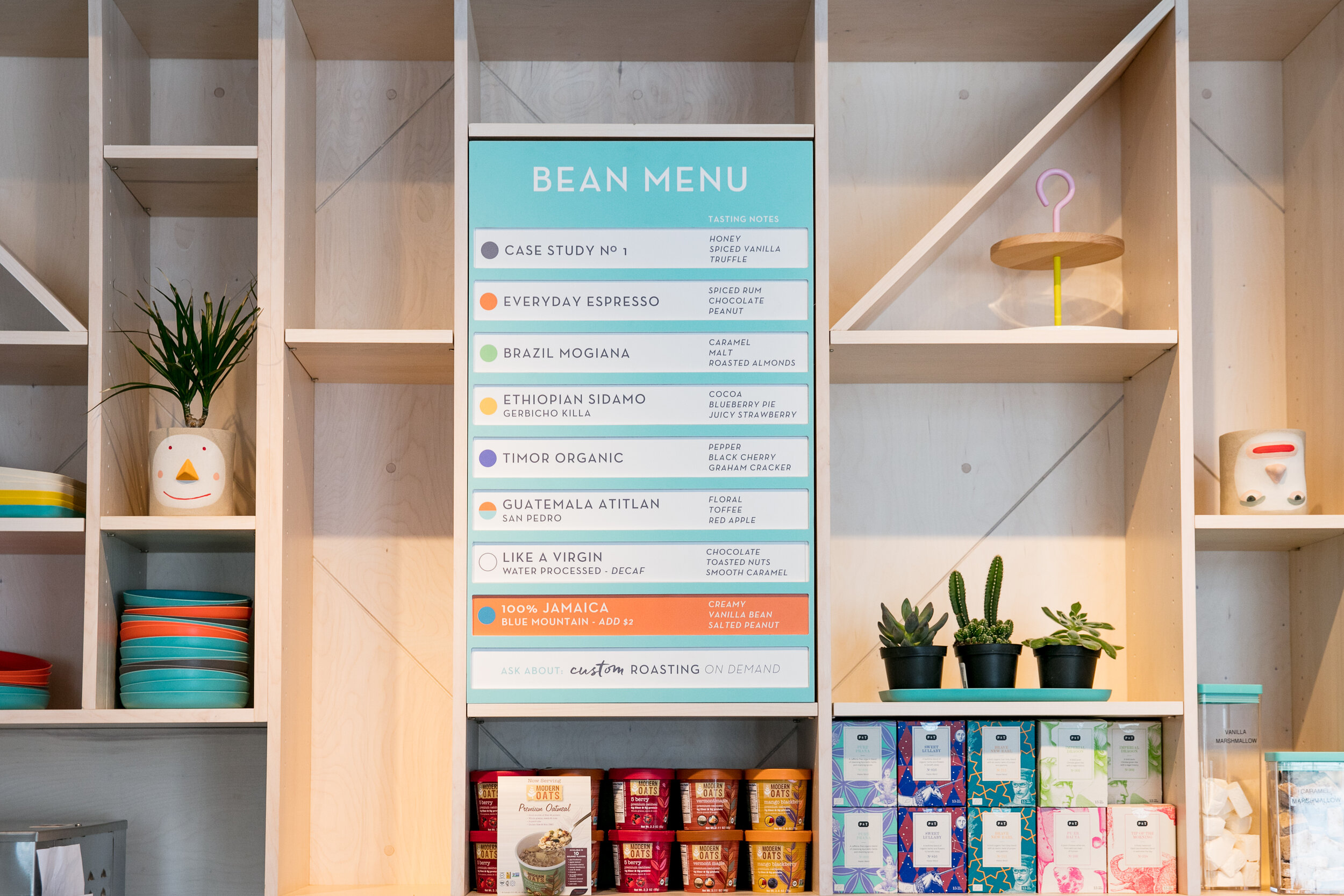
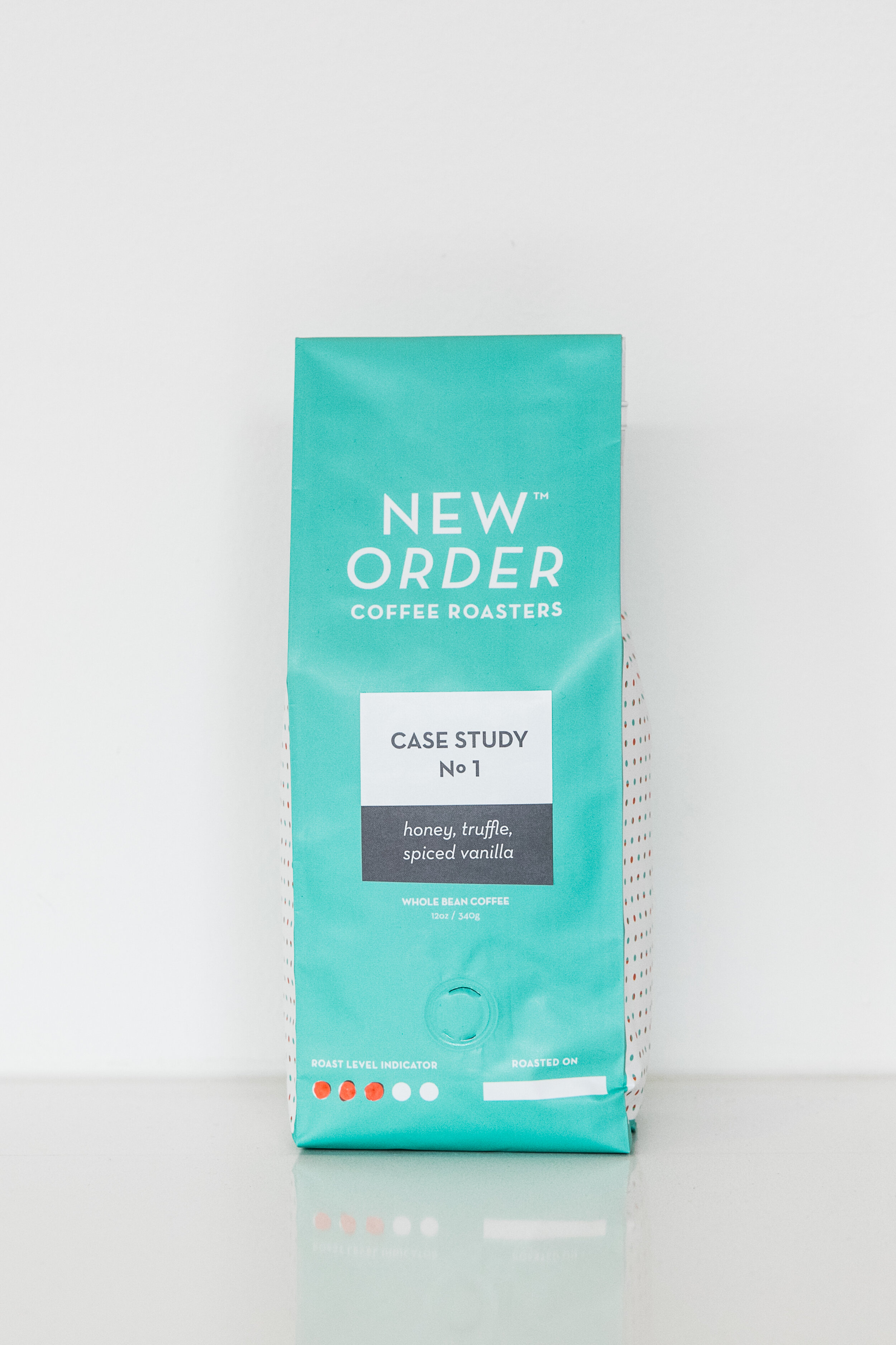
Through discussion, it was agreed upon an icon was necessary and a geometric, simplified, abstract coffee mug was introduced to echo the geometric shelving units planned within the interiors. A playful geometric dot pattern, timeless yet playful and reminiscent of confetti, was also developed to create more texture and personality throughout the interior environment and on packaging.
A design system for beans and packaging was also important, especially in regards to sourcing. A color system was applied to represent different regions throughout the globe, and was extremely budget friendly. This would allow New Order to use the same coffee bag design but apply different stickers, which accommodates their small run in-house roasted beans. This color system would also correspond with in-store menus as well.
The visual identity extended everywhere throughout the store, requiring the design for additional items including, but not limited to:
menu design
product and retail design, including packaging
store exterior and interior signage
promotional posters and postcards
holiday window graphics and displays
employee aprons
employee handbook and coffee guides
online webstore
Project Goals
To develop a distinct visual identity system and messaging for New Order Coffee Roasters
To challenge the visual tropes and stereotypes of the "third wave" coffee movement
Project Challenges
Competition in a crowded market for both craft coffee and generic coffee
Perception as approachable and playful, yet knowledgeable, professional, and tech-forward
First location was in the up-and-coming Brush Park neighborhood in Detroit with little current foot traffic
Project Impact
In 2019, New Order Coffee Roasters opened their second location in Royal Oak, Michigan
In 2019, New Order Coffee Roasters partnered with Ford to include a coffee kiosk in their Dearborn Headquarters
In 2018, New Order Coffee Roasters was a nominee for the Specialty Coffee Roasters Association DESIGN LAB Packaging Award, which "identifies some of the most compelling coffee packaging designs from the past year," and "seeks to highlight the best in our industry"
2018, Unsold Studio's work with New Order Coffee Roasters was invited to be the branding case study for Design Core Detroit's publication, Design Guide: Neighborhood Business: A Practical Resource for Understanding and Working with Designers to Bring Your Brick and Mortar Business to Life
Unsold Studio and project architects Et Al Collaborative won a 2018 Commerce Design: Detroit award, "a new competition introduced in April as one of the many projects included in the UNESCO City of Design Action Plan
Design-Related Press
The Dieline "The Colorful Look of This Coffee Brand Helps It Stand Out From Others"
Sprudge "Build-Outs of Summer: New Order Coffee in Detroit, MI"
Index Design "Le concours Commerce Design pourrait bientôt voir le jour à Détroit"